Logo Use
/https://siu.edu/search-results.php
Last Updated: Sep 29, 2025, 11:53 AM
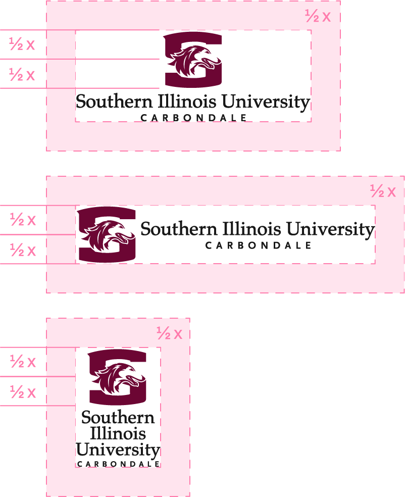
Clear Space
To ensure the SIU logo maintains its visual impact and legibility, it must always be surrounded by sufficient clear space. This space acts as a buffer zone, free of any text, graphics, images, or page edges that might compete visually with the logo.
The minimum required clear space around the SIU logo is equal to half the height of the logomark (the stylized "S" icon). This measurement should be applied on all sides regardless of the logo’s size or placement.
Avoid placing the logo near other visual elements, cropping it against edges, or overlaying it on busy backgrounds that compromise readability.

Minimum Size
The Southern Illinois University signature should be produced at a reasonable size to maintain legibility and clarity.
The preferred minimum widths and heights for print materials are shown below for each of the SIU signatures.
- Vertical Orientation: 1.75" w x .75" h
- Horizontal Orientation: 2.625" w x .5" h
- Stacked Orientation: .75" w x 1.125" h
Photo Backgrounds and Background Colors
The SIU logo should be placed in a way where it is clearly readable and clutter free. The logo should be placed only over maroon, black, white or another neutral color. The logo should not be placed over competitor school colors.
Improper Executions/Usage
It is extremely important to the brand identity that the Southern Illinois University signatures be displayed correctly. Always use the correct typefaces and the correct relative positioning and size of all elements.
The only acceptable color treatments for the logomark are SIU Maroon, black, and white.
- Do not distort any portion of the logo.
- Do not make the wordmark maroon in a 2-color application.
- Do not tilt the logo.
- Do not substitute the typefaces.
- Do not rearrange components in the logo.
- Do not alter the alignment of any component of the logo.
- Do not add a drop shadow or any other embellishment to the logo.
- Do not apply a gradient to the logomark.
- Do not apply a tint to the logomark.
- Do not screen back the logomark.
- Do not use logos or identifiers as design elements within additional artwork.